It seems strange, even to me, that in spite of a lifetime using fountain pens, I had never previously gotten all that into inks. I used whatever was available, eventually falling in love with Waterman’s Florida Blue and Aurora’s black inks. And then Waterman went and discontinued Florida Blue. Sure, I bought up a bunch of it before it disappeared, but I found myself in ink crisis wanting to find something that I liked as much.
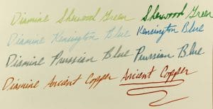
Witness the way sunlight fades fresh Diamine ink. The left writing sample spent 4 months in direct sunlight. The right writing sample is fresh out of the bottle. I was particularly impressed by the color, clarity and resistance to harsh UV rays in the Diamine Ancient Copper ink.
This coincided nicely with a new generation of people exploring the wonders of many ink colors and brands! Now I have the bug, too. While still questing for my perfect Florida Blue replacement, I’ve been branching out trying new colors.
A penpal in Germany turned me on to the many wonders of Diamine last autumn. I picked out 4 colors to order and try on my own. I also performed an ink-fast test on them to see how they held up after spending 4 months in my window, during winter’s weaker light. Here are the results:
SHERWOOD GREEN: I’ve always loved Robin Hood stories, since I watched the Errol Flynn flick as a kid. Fresh on the page, it is a little darker and more yellow than I would have preferred, but it made a great ink for my Christmas cards last year. Given how dark and rich it is, I was surprised when it faded this much.
KENSINGTON BLUE: This is a beautiful dark blue with aqua accents in the shadowing, which you can’t see as well in this sample. Unfortunately, it suffers the same fate as many blues by fading too much over time.
PRUSSIAN BLUE: Given some German ancestry and an appreciation of their cheek-scarring fencing tactics, I had to try this ink. It is a good blue-black with some very nice shadow effects. As I am finding with other blue-blacks, it holds up a little better under the sun’s harsh rays.
ANCIENT COPPER: Hands down my favorite new ink of the past year! It’s rich, dark orange looks incredible when spread thin with a stub and then brought to a thick, darker clot when laid down thicker at the top or bottom of a loop. Its only downside is that it does seem to clog a bit in the pen over time. If I give my trusty Pelikan 800 a thorough flushing between refills, I have no troubles whatsoever. Best of all, it hardly fades at all, unlike my beautiful but fickle blues.